


Removing friction from identity checks for Victoria ID users worldwide
Introduction
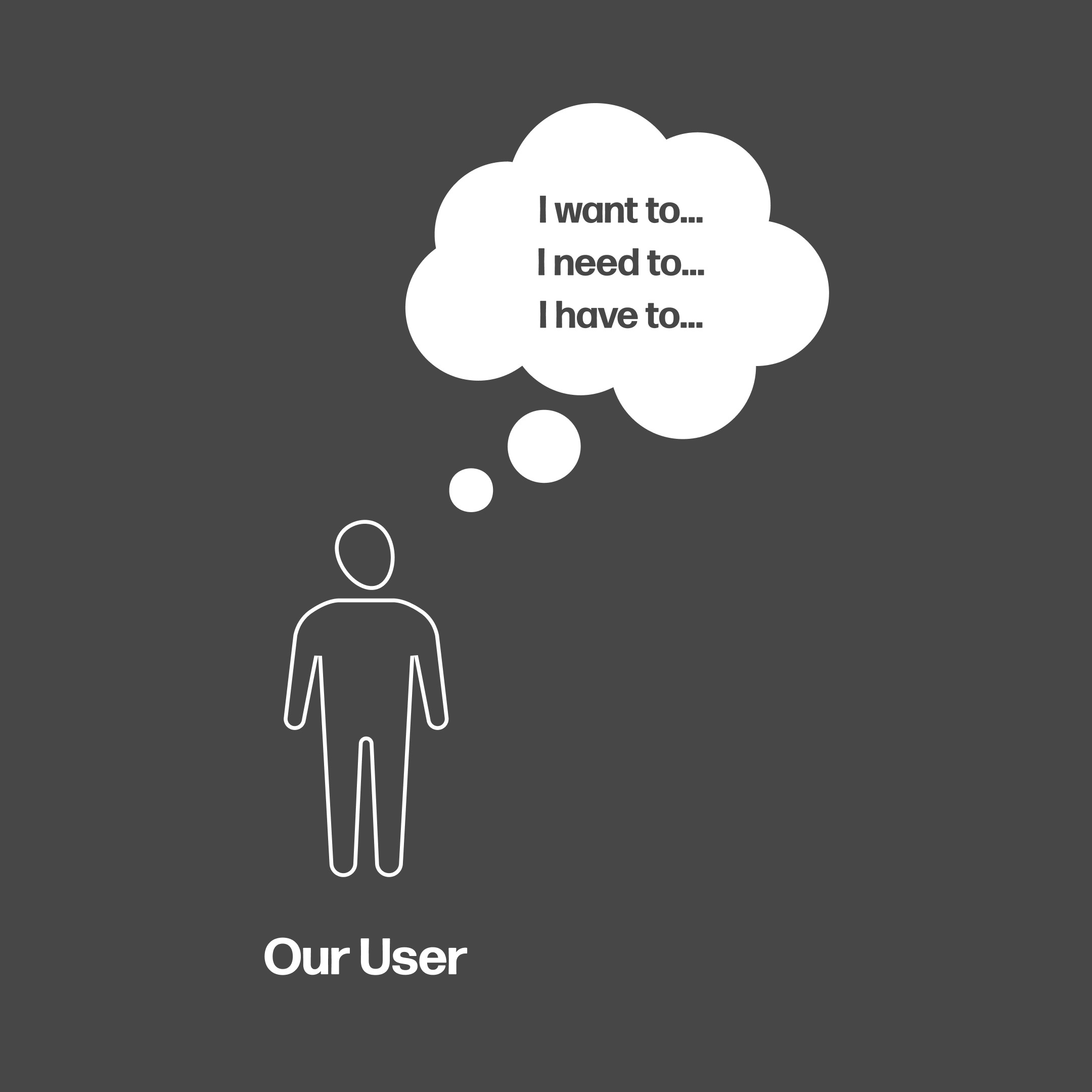
Identity checks happen everywhere in daily life. Opening a bank account. Renting a car. Applying for a job or university. Yet the experience is almost always slow, confusing and uncomfortable. People want to move forward, but the process gets in the way.
My role was to design a new validation product from the ground up. A human first web and native app experience that feels clear, supportive and respectful. I led product discovery, design, stakeholder collaboration and user research, working closely with developers to define both the experience and its underlying structure.
Challenge
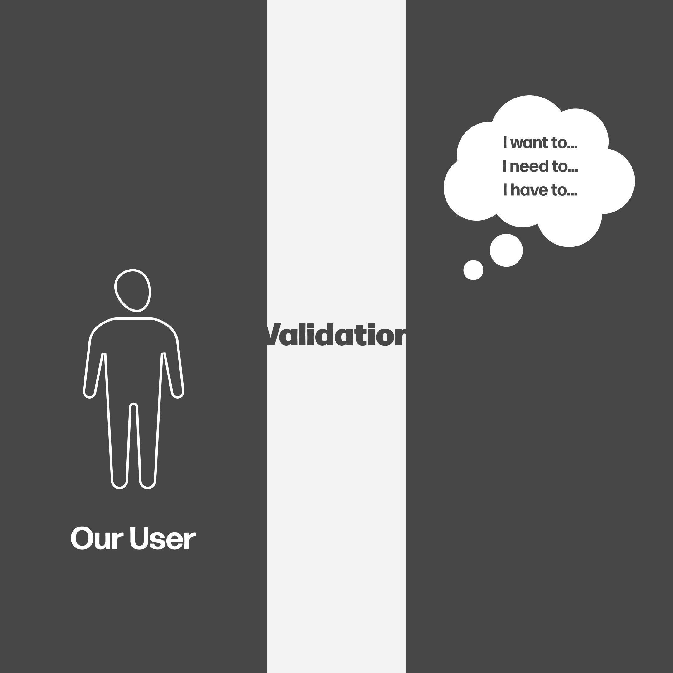
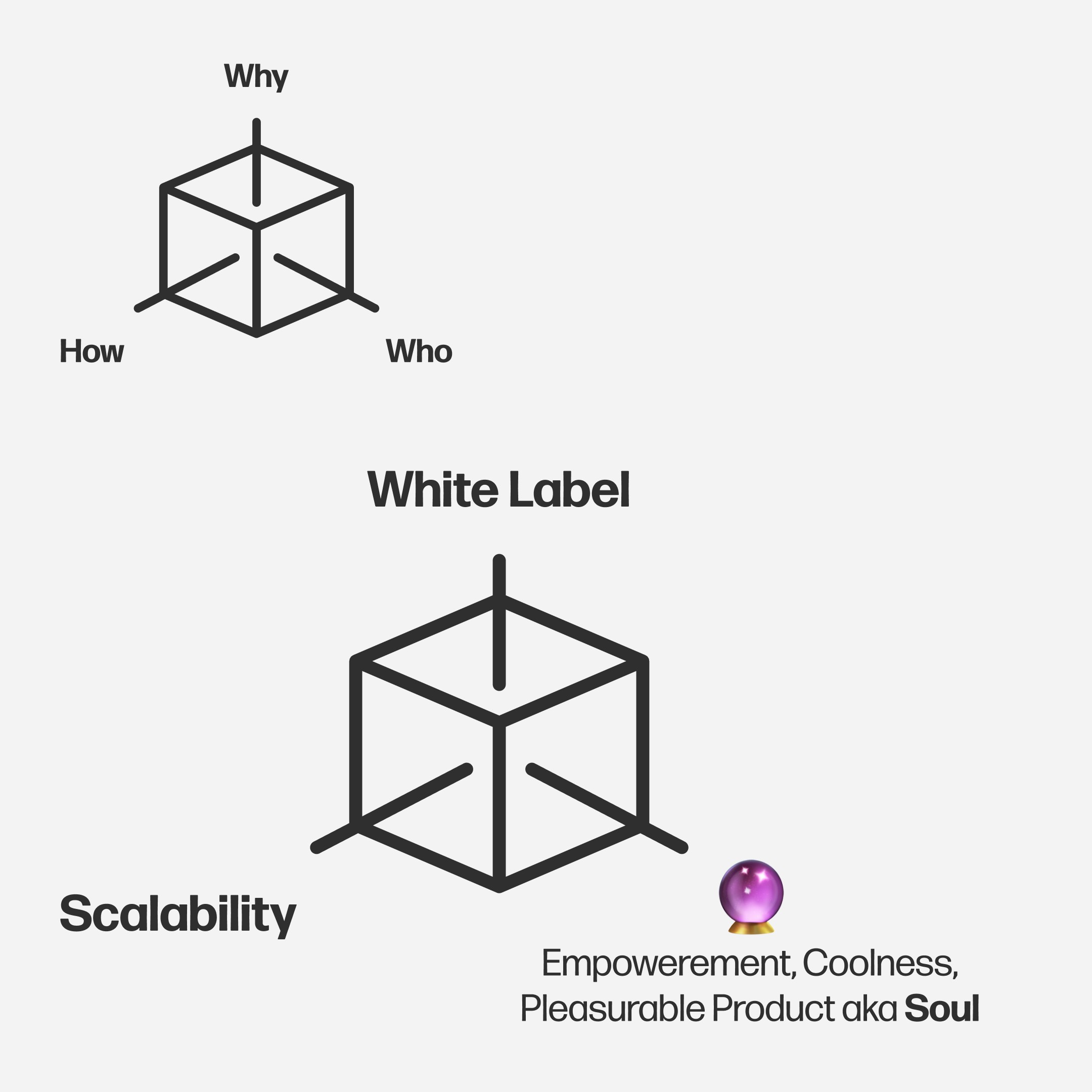
There was no existing product. We were starting at zero. This meant defining the experience model, the interaction patterns, the language, the emotional tone and the system logic. At the same time, the product needed to be white label, scalable and flexible enough to support many different types of identity checks both now and in the future.
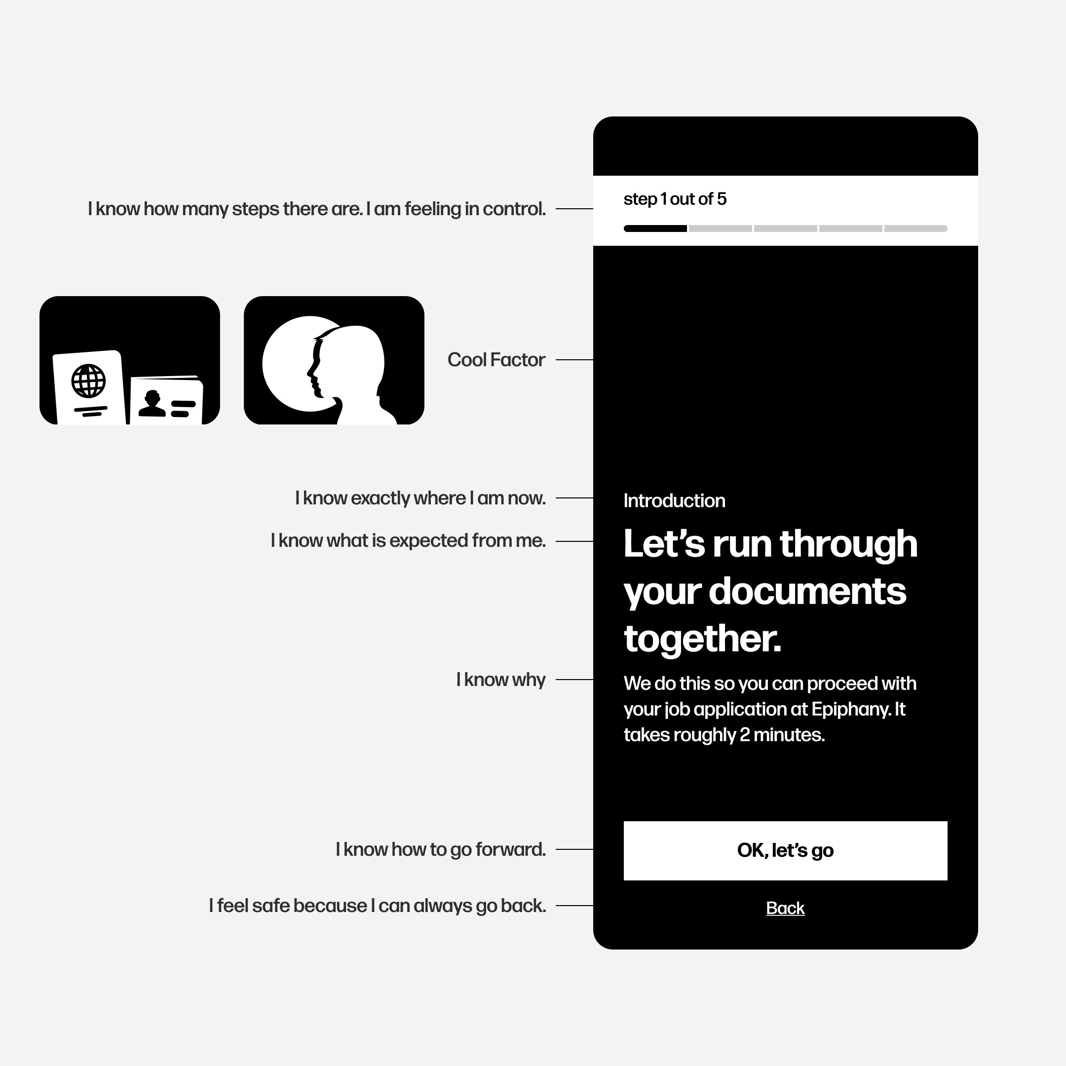
The challenge was to create a validation experience that feels simple and human, even when dealing with sensitive information. And to make sure that people with low digital confidence could move through the process without stress or uncertainty.
Process
We began by learning from the people who would actually use the product. We spoke with individuals in different life situations and with different levels of digital familiarity. Their stories helped us understand what creates trust and what creates friction. Across all cases, the need was the same: clear guidance, one calm step at a time.
We explored the experience through storytelling rather than screens. Instead of starting with UI, we focused on how the user should feel at each point in the journey. This guided our decisions on tone, pacing and information hierarchy.

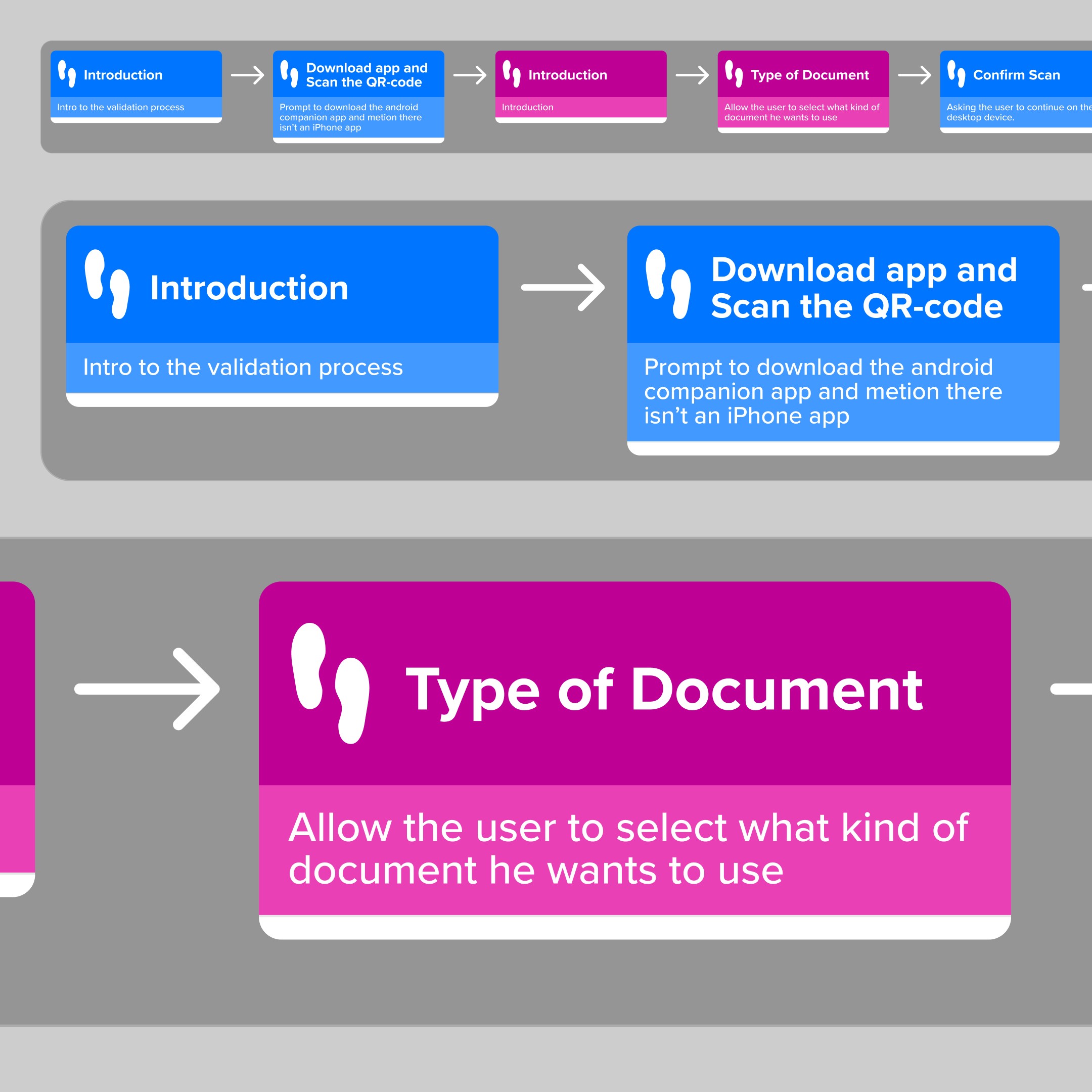
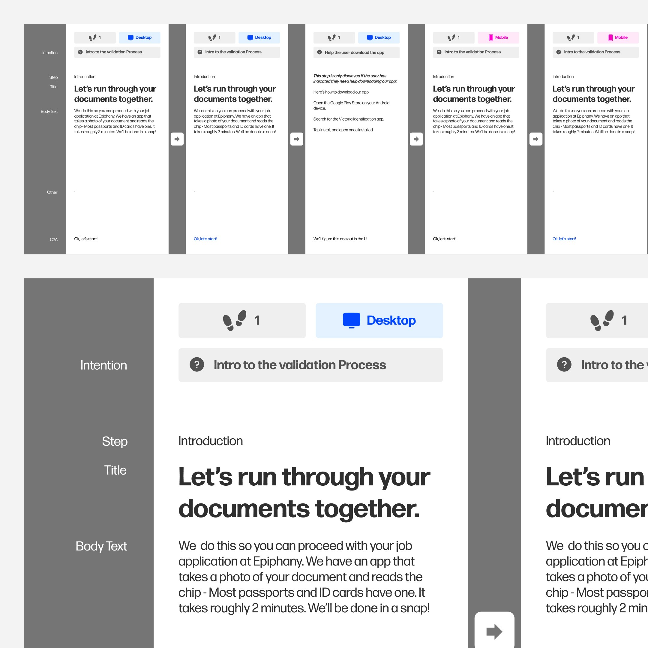
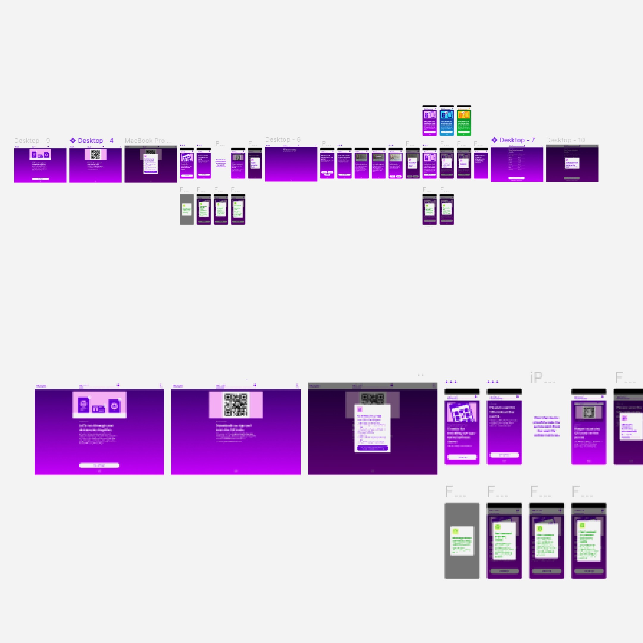
Wireframes in black and white allowed us to shape structure before style. We tested full journey segments rather than isolated screens to observe emotional progression. Iterations were fast and grounded in direct user feedback.
Throughout, I aligned product, management and engineering around the experience principles, making sure that every decision reinforced simplicity, clarity and dignity.
Solution
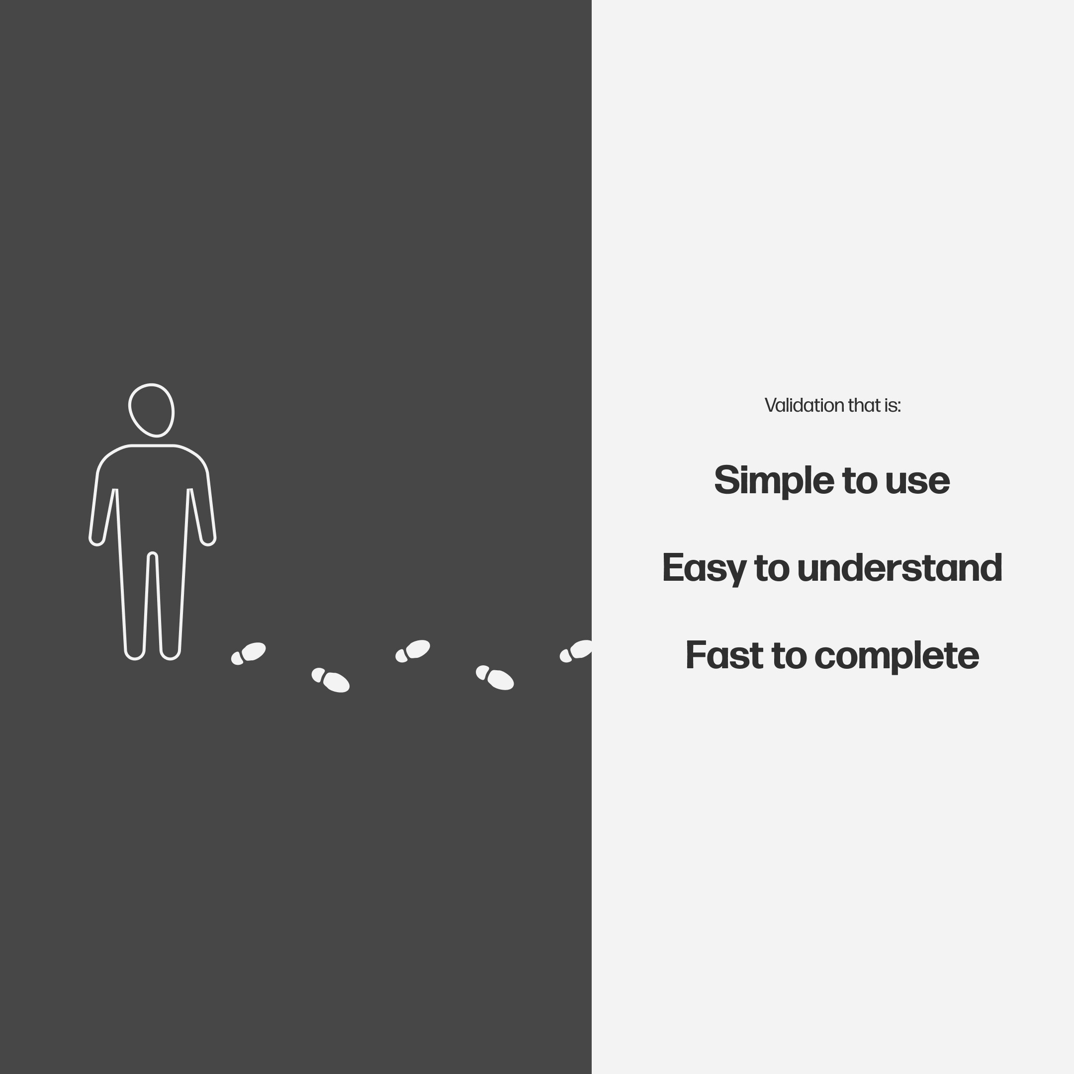
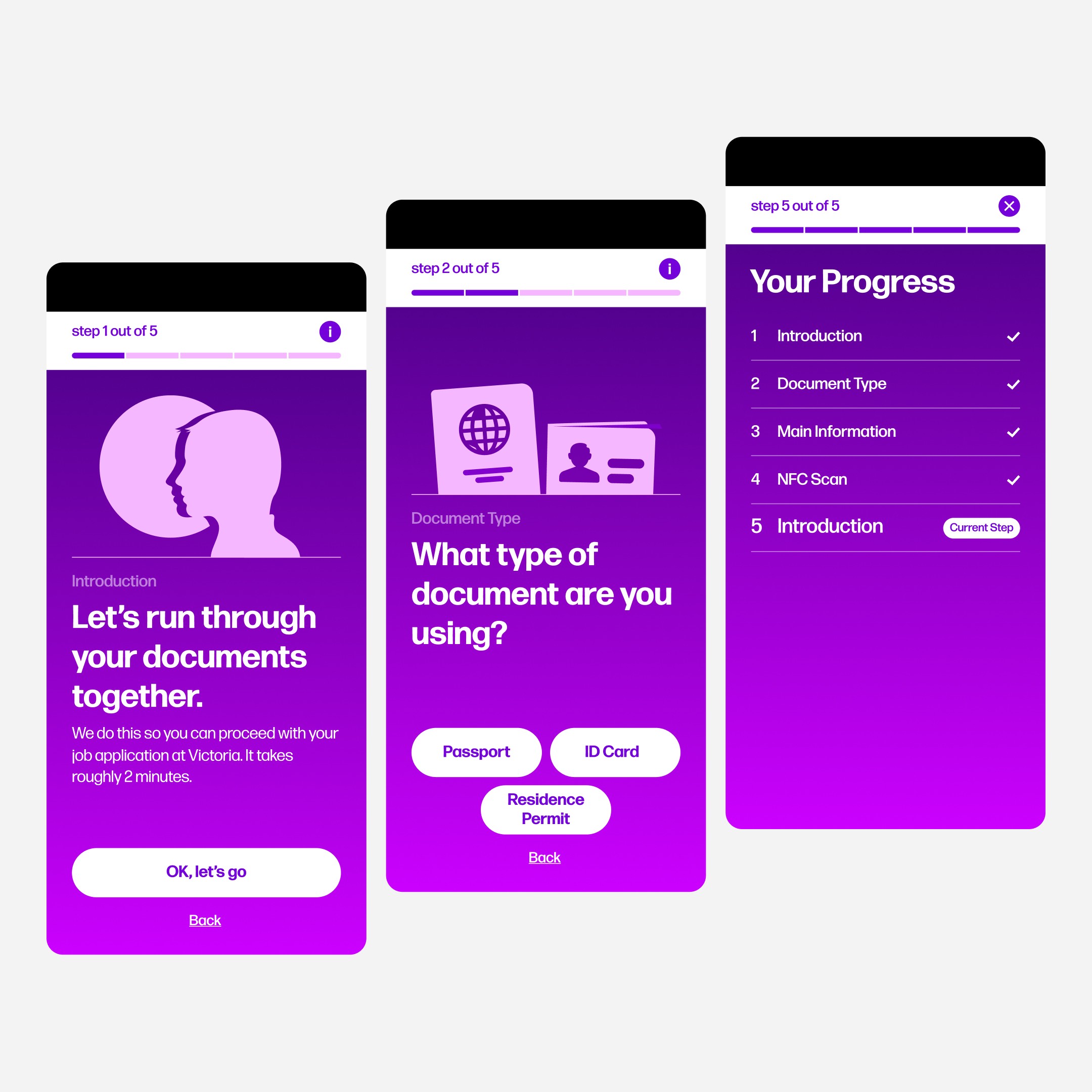
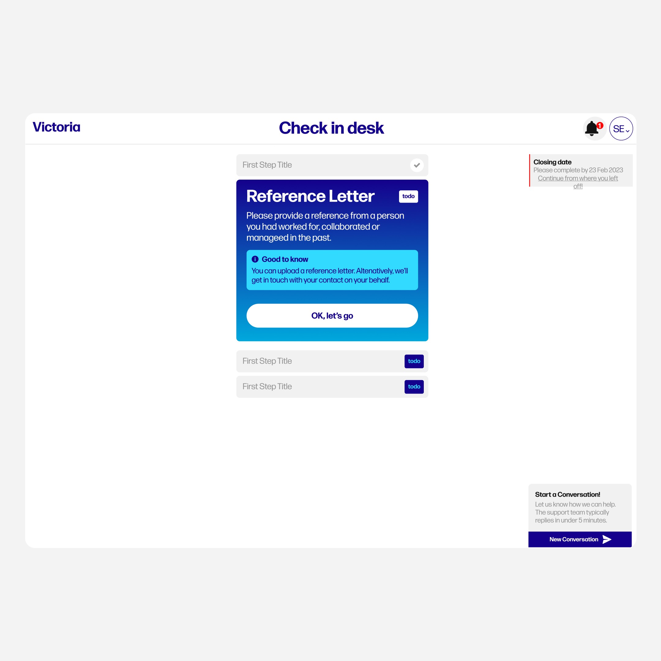
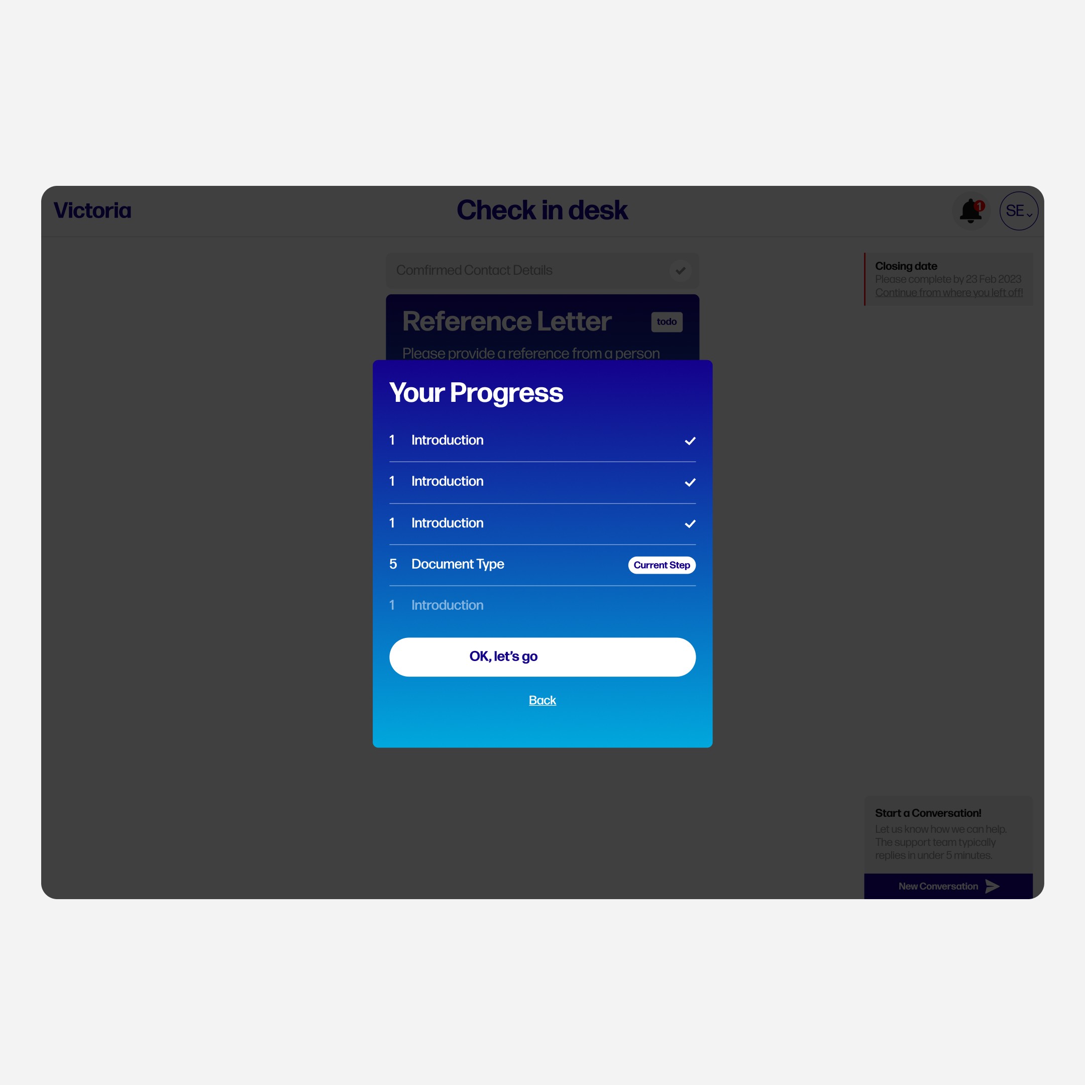
The final product is a white label identity validation experience that works seamlessly across web, iOS and Android. It guides users step by step in a calm, reassuring sequence. Language is simple and human. Visual hierarchy makes each action feel clear and manageable. The product supports different validation types, including livelyness checks, passport scans and reference confirmation, without overwhelming the user.
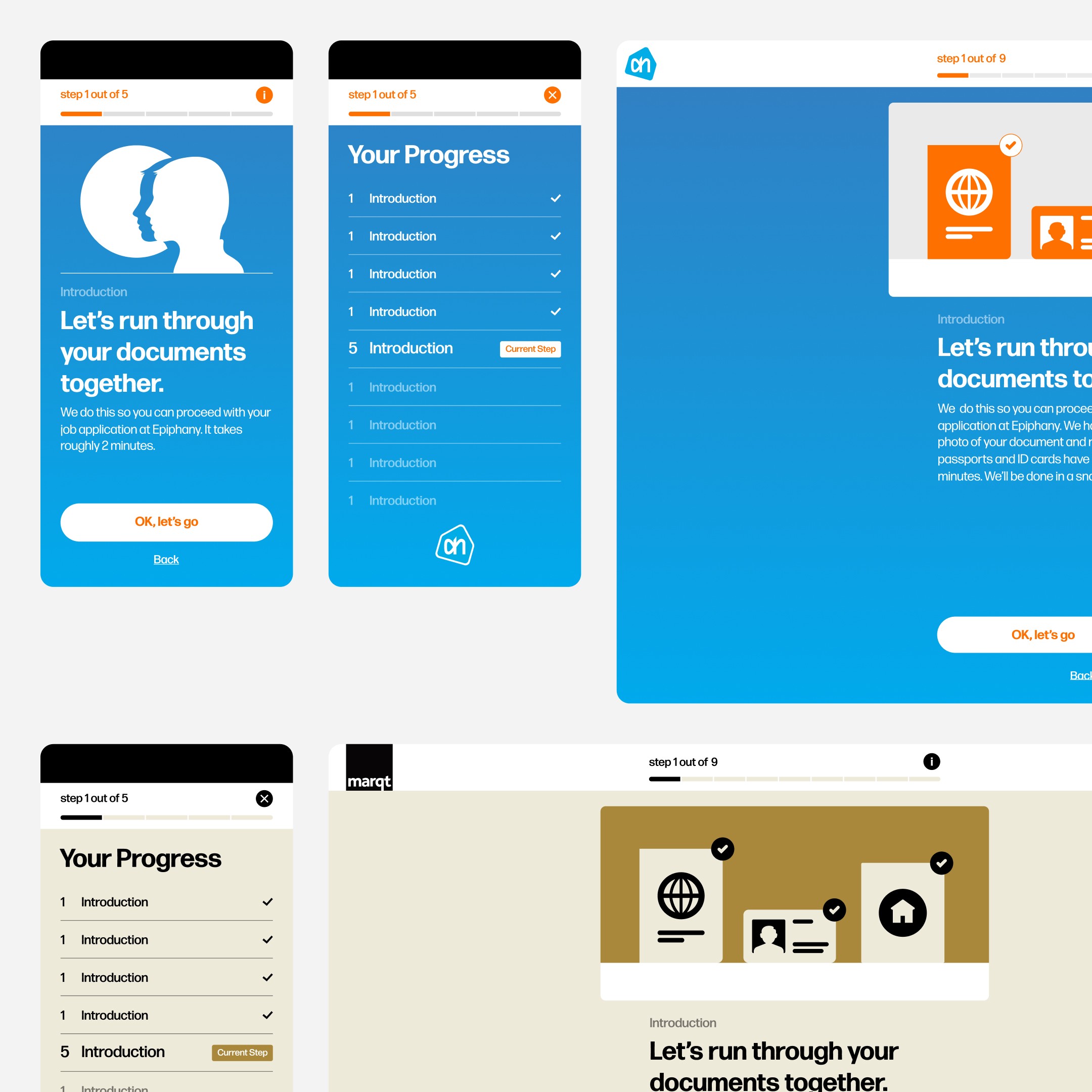
A flexible design system was created to carry the experience forward. It ensures consistency across features and allows new validation methods to be added without redesigning the core flow. The product feels stable, scalable and adaptable across brands.
Reflection
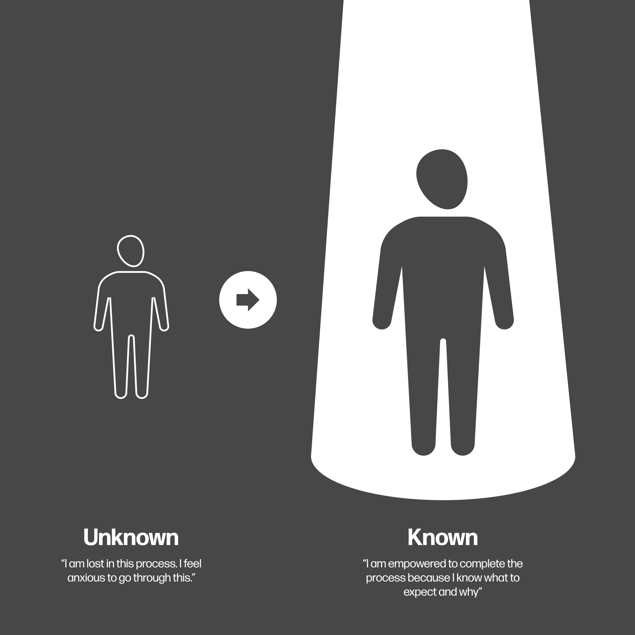
This project highlighted the value of designing for emotional clarity. When people are asked to share personal information, the tone and pacing of the experience matter just as much as functionality. A human first approach builds trust and confidence. And trust is what makes progress possible.
The work behind the work
For the curious minds: how the sausage is made (but prettier). Process, decisions, prototypes, the whole thing.
Select a case study…